1
/
of
7
ShopOnlyDeal
Retro Gray Lift-Top Coffee Table | Wood Lift Table Top for Living Room | Versatile Side and End Table
Retro Gray Lift-Top Coffee Table | Wood Lift Table Top for Living Room | Versatile Side and End Table
Regular price
$738.00 CAD
Regular price
$1,101.00 CAD
Sale price
$738.00 CAD
Unit price
/
per
Tax included.
Shipping calculated at checkout.
Couldn't load pickup availability
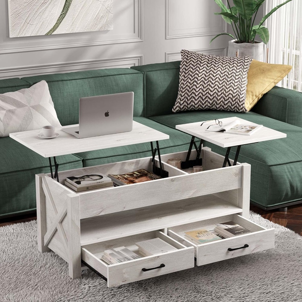
Introduce classic charm to your living room with this Retro Gray Lift-Top Coffee Table, crafted with a wooden lift-top for added functionality. This versatile piece serves as a coffee table, end table, or side table, providing a multi-functional addition to your home. The lift-top feature allows for an adjustable surface height, ideal for dining, working, or extra storage. With a timeless gray finish, this table adds a vintage touch to any decor, combining style with practical utility.
Highlighted Features:
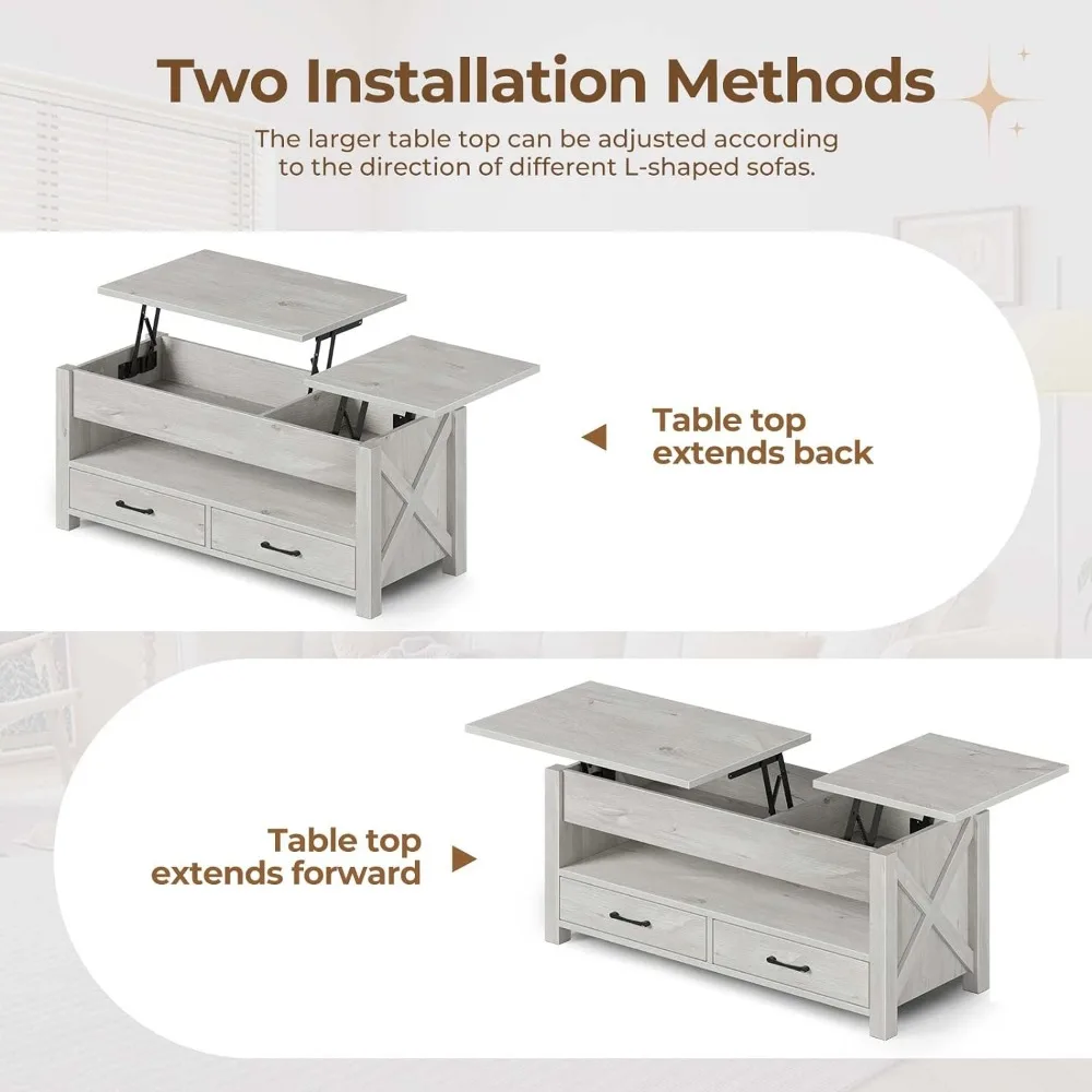
- Lift-Top Design: Easily raises for versatile use as a workspace, dining surface, or storage.
- Retro Gray Finish: Adds a stylish, vintage touch to your living room or home decor.
- Wooden Construction: Durable and sturdy, made to withstand daily use.
- Multi-Functional: Serves as a coffee table, end table, or side table.
- Compact and Practical: Ideal for small spaces or as an accent table in larger rooms.
- Easy to Pair: Complements a range of decor styles, from retro to modern.
- Spacious Table Top: Perfect for displaying decor, storing essentials, or casual use.
- Origin : US(Origin)
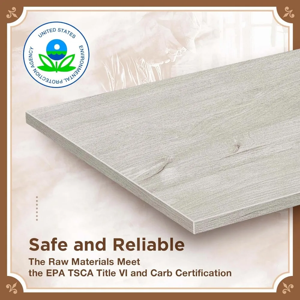
- Hign-concerned Chemical : none
- Usage : HOME
- Folded : No
- Finishes Material : Tabletop
- Installation Method : Assembly
- Material : Wood
- Applicable Number : 4
- Shape : Rectangle
- Appearance : Modern Style


.aplus-v2 .apm-brand-story-carousel-container {
position: relative;
}
.aplus-v2 .apm-brand-story-carousel-hero-container,
.aplus-v2 .apm-brand-story-carousel-hero-container > div {
position: absolute;
width: 100%;
}/*
Ensuring the carousel takes only the space it needs.
The sizes need to be set again on the absolutely positioned elements so they can take up space.
*/
.aplus-v2 .apm-brand-story-carousel-container,
.aplus-v2 .apm-brand-story-carousel-hero-container {
height: 625px;
width: 100%;
max-width: 1464px;
margin-left: auto;
margin-right: auto;
overflow: hidden;
}
/*
This centers the carousel vertically on top of the hero image container and after the logo area (125px).
Margin-top = (heroHeight - cardHeight - logoAreaHeight) / 2 + logoAreaHeight
*/
.aplus-v2 .apm-brand-story-carousel .a-carousel-row-inner{
margin-top: 149px;
}
/*
Cards need to have a width set, otherwise they default to 50px or so.
All cards must have the same width. The carousel will resize itself so all cards take the width of the largest card.
The left margin is for leaving a space between each card.
*/
.aplus-v2 .apm-brand-story-carousel .a-carousel-card {
width: 362px;
margin-left: 30px !important;
}
/* styling the navigation buttons so they are taller, flush with the sides, and have a clean white background */
.aplus-v2 .apm-brand-story-carousel .a-carousel-col.a-carousel-left,
.aplus-v2 .apm-brand-story-carousel .a-carousel-col.a-carousel-right {
padding: 0px;
}
.aplus-v2 .apm-brand-story-carousel .a-carousel-col.a-carousel-left .a-button-image,
.aplus-v2 .apm-brand-story-carousel .a-carousel-col.a-carousel-right .a-button-image {
border: none;
margin: 0px;
}
.aplus-v2 .apm-brand-story-carousel .a-carousel-col.a-carousel-left .a-button-image .a-button-inner,
.aplus-v2 .apm-brand-story-carousel .a-carousel-col.a-carousel-right .a-button-image .a-button-inner {
background: #fff;
padding: 20px 6px;
}
.aplus-v2 .apm-brand-story-carousel .a-carousel-col.a-carousel-left .a-button-image .a-button-inner {
border-radius: 0px 4px 4px 0px;
}
.aplus-v2 .apm-brand-story-carousel .a-carousel-col.a-carousel-right .a-button-image .a-button-inner {
border-radius: 4px 0px 0px 4px;
}


